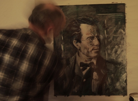
Another, bigger painting of Gustav Mahler!
|
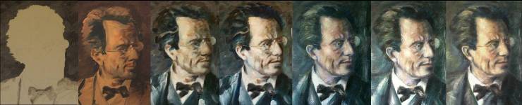
| In December 2011 I decided to do yet another picture of Gustav Mahler, and decided to take photos as I "progress" to see how it develops. If it turns out OK, this will remind me how I did it. If it all goes wrong, this might show me why! |
 |
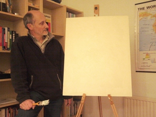
Step 1: cut a piece of hardboard to the right size... ...paint it with emulsion, sandpaper it and repeat that process a few times. Then pose for a photo. This is probably the best this painting is ever going to look! |
 |
|
||
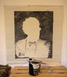 |
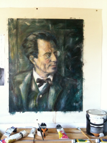
Step 2: Pin some plain paper to the wall, nail the board to the wall on top of the paper, draw / copy / trace your sketch onto the board and start "blocking in" basic shapes with more emulsion mixed in with a little black acrylic. I had intended to do a first pass in monochrome, just flagging up lights and darks, but I didn't really stick to the plan and you can see some colours already creeping in here! All I'm really doing at this stage is getting the basic outline, that was originally just pencil lines, marked on as paint, and trying to make it look about the right shape. | 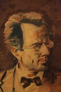 |
 |
Step 3: slap on more paint. Make sure there is a strong light in the picture and try to keep everything lively in the paint. This "sketchy" stage involved lots of "going back to the big white brush" to make sure I wasn't doing my usual trick of blurring everything to a muddy mid-tone! |
.jpg) |
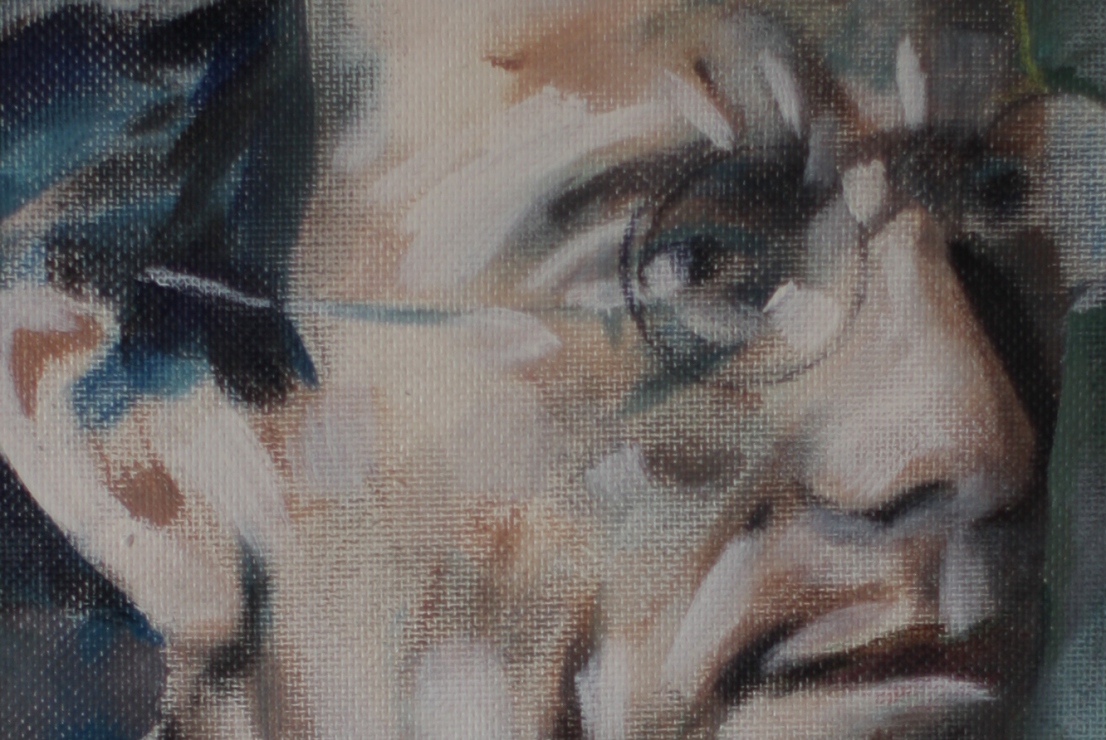
I often think I should really leave my paintings at this stage. I like them best when they are at this fluid scruffy sketchy stage. I like being able to see that big patches of light and shade are just splashed on with the decorator's brush. I think a lot of the courage of art is the courage to stop. i don't seem to have that. Click the picture on the left for a closer look, or on the picture below for a real close up of a bit of the board at about life size.
|
|
However... in this case, I blundered on...
If in doubt, slap on some splashes of white emulsion to brighten things up! |
.jpg) |
One of the ideas I was interested in playing with this time was to build up layers of transparent paint to give the finished thing a feeling of some depth. I had the idea that I might put some bright splashes of white on the highlights then wash over them with transparent colours so that they still showed as highlights but modified by the washes over them. I thought It try this using watery washes and washes made by mixing in a glazing medium with the paint. Then Debbie bought me some watercolour pencils and I thought I'd throw some of that in as well... So at this stage it's all getting a little out of control. When it looked bad, I tried "distressing" the surface (and obliterating bad layers) with sandpaper. The coloured pencil seemed to work quite well for me, but since it was water-based I needed to fix it occasionally before applying any more layers, so I started spraying the whole thing liberally with fixative from time to time. So by March 2012 this painting had been through quite a lot. |
.jpg)
This picture above shows how the coloured pencil does seem to show through subsequent glazes to give both texture and depth, but also shows up some of the disappointing overall flatness of this possibly overworked stage of the painting.
 |
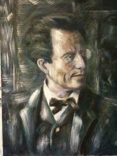
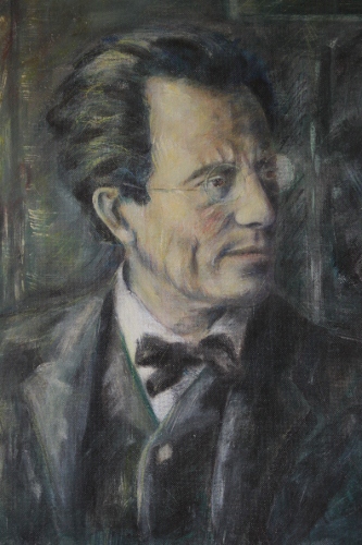
Whenever it started to look a bit flat I slapped on some bright lights with my fat brush. If it started to look at bit pale I splashed some warm washes over everything. If it comes out too colourful or high-contrast: sandpaper it. If it just starts to look a mess... well, I really don't know. Just keep going i guess. At this stage I took my mind of the bigger problems by looking at a few details like the ear I didn't like, and the eye that lacked life, and the bottom of the nose that was a bit flat. I also had a bit of a wash-disaster when a "transparent wash turned out to be anything but and I masked the whole painting in a pale, opaque glaze. (Sandpaper, and plenty of it, nurse!). And so we entered April on something of a negative. We may need to embark on something desperate... watch this space and keep your fingers crossed. |
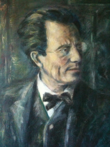
April 10th - April 11th: This is the outcome of the opaque wash disaster. He was looking a little vibrant so I tried the wash, then it went a bit wrong so I tried the sandpaper, glaze, more sandpaper treatment...
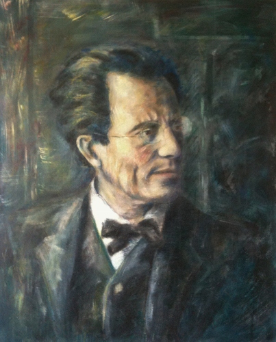
To cut a long story short (I'll fill in some of the intermediate stages later when I get a chance!) the painting was finished and framed and accepted into the Three Counties Open Art Exhibition in November 2013. This is what it looked like at that stage:
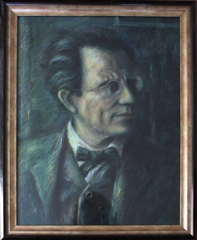
I'm really not at all convinced by the way it ended up, and although I'm delighted that it was accepted for the Exhibition, I really think I need to have another shot at this project. Let's call this one a rough sketch for the next one, shall we?